Best Colors to Wear on Camera for Flattering Photos | Candid Studios
Stepping in front of a lens, whether for a crucial video conference, a family portrait, or a professional headshot, involves more than just what you say. It’s about how you present yourself, and color is your most powerful non-verbal tool. The wrong choice can wash you out, clash with your background, or create distracting visual noise that undermines your message. The right one, however, enhances your skin tone, conveys confidence, and ensures you look polished and professional. This guide moves beyond generic advice to provide a curated list of the best colors to wear on camera.
We will explore specific shades that consistently perform well, explaining the psychology behind them and offering actionable tips for various scenarios. From the universally flattering power of deep blue to the modern sophistication of blush pink, these are the colors that will help you command attention and make a lasting impression. Beyond understanding specific color palettes, leveraging technology can further boost your confidence. For instance, you can discover how virtual dressing rooms can help you visualize your look before you even commit to a purchase, ensuring your on-screen attire is perfect.
This article provides a clear roadmap to selecting your wardrobe with intention. We’ll cover the top camera-friendly colors, detailing why each works and how to style it for maximum impact. You will learn which hues complement different skin tones, how to coordinate with your environment, and what to avoid so your final image is exactly what you envision.
1. Deep Blue
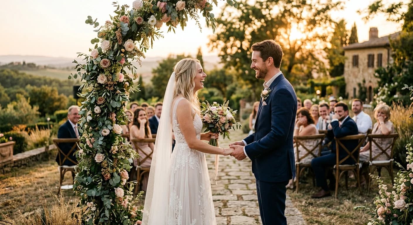
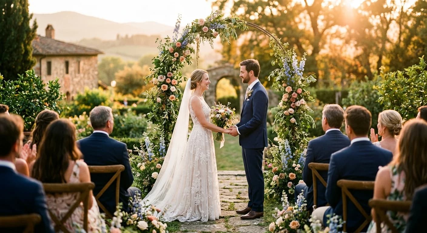
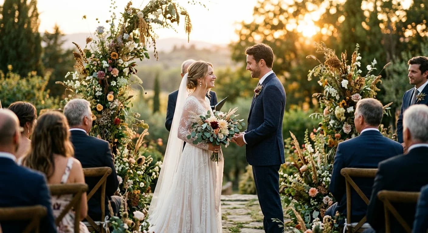
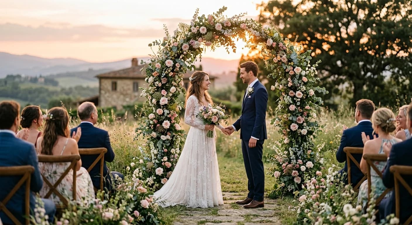
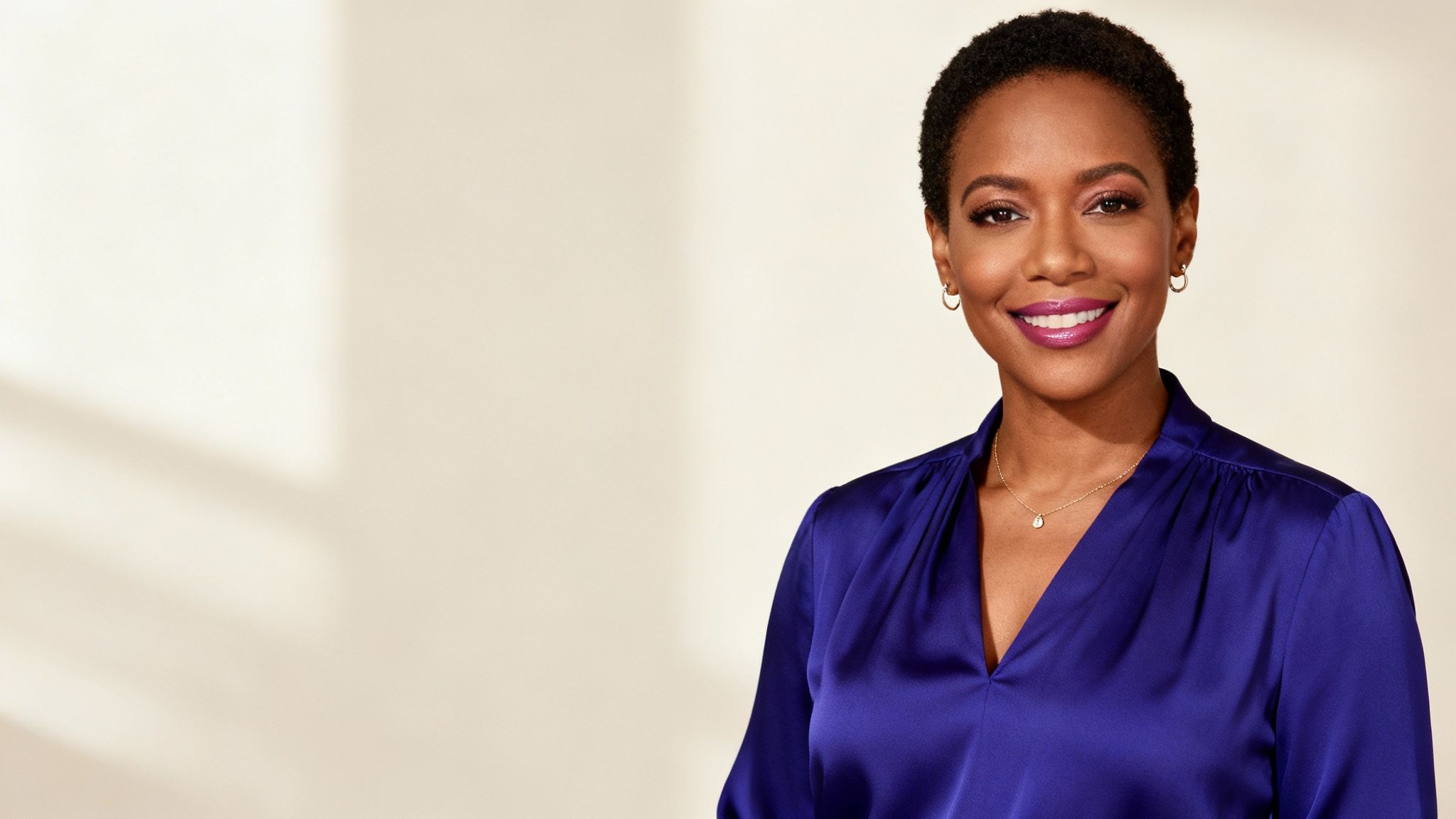
Often cited as the most reliable and universally flattering choice, deep blue is a powerhouse color for any on-camera appearance. It commands authority and conveys trustworthiness without being overpowering, making it one of the best colors to wear on camera for professional settings. Unlike pure black, which can crush detail, or bright white, which can blow out highlights, deep blue provides excellent contrast that defines your silhouette against most backdrops.
This color family, especially navy and royal blue, projects an image of stability, intelligence, and confidence. It’s a favorite among news anchors, political figures like Barack Obama, and corporate executives for a reason: it helps the audience focus on the message rather than the wardrobe. The color is serious yet approachable, and it works exceptionally well under both studio and natural lighting conditions.
Why Deep Blue Works So Well
Deep blue is a primary color, which means it complements nearly every skin tone. It can bring warmth to cooler complexions and provide a rich, grounding contrast for warmer ones. Its versatility makes it a safe and impactful choice whether you’re filming a corporate video, sitting for a headshot, or presenting a TED Talk.
Key Insight: Deep blue is the ultimate “safe-bet” color for video. It reads as professional, looks good on virtually everyone, and avoids the technical pitfalls of pure black or white, ensuring you and your message are the primary focus.
Actionable Tips for Wearing Deep Blue
To make the most of this classic choice, consider these practical tips:
- Choose the Right Shade: Opt for navy, royal blue, or sapphire. Avoid overly bright cobalt or electric blues, which can create color “vibrations” or moiré patterns on some cameras.
- Pair with Neutrals: Complement your deep blue outfit with soft neutrals like off-white, light gray, or beige. Silver accessories also pair beautifully, adding a touch of brightness without creating distracting reflections.
- Check Your Lighting: While deep blue is forgiving, poor lighting can make it appear flat or almost black. Ensure your key light is strong enough to bring out the color’s richness and dimension.
- Incorporate Texture: A navy blue blazer with a subtle texture or a royal blue knit sweater can add visual interest and prevent the color from looking one-dimensional on screen.
For professional portraits and headshots, selecting the right colors is a crucial step in preparation. To explore more about how to get ready for your session, you can get additional tips on how to prepare for professional headshots.
2. Jewel Tones (Emerald, Sapphire, Ruby)
For those looking to make a memorable impact, jewel tones like emerald, sapphire, and ruby offer a sophisticated and vibrant alternative to standard neutrals. These rich, saturated colors are inspired by precious gemstones and translate beautifully on camera, adding depth and personality without being distracting. They strike a perfect balance between professional and creative, making them one of the best colors to wear on camera for anyone wanting to stand out with elegance.
Unlike pastels that can wash out or neons that overwhelm the sensor, jewel tones provide excellent color saturation that holds up well under various lighting conditions. They project confidence, creativity, and a touch of luxury, which is why they are often favored by creative professionals, influencers like Oprah Winfrey, and brand spokespeople. An emerald green blouse or a ruby red dress can command attention while maintaining a polished and authoritative presence.
Why Jewel Tones Work So Well
Jewel tones are universally flattering because their depth and richness enhance almost every skin tone. They provide strong, clean color without the harshness of primary brights, making you pop against neutral backgrounds. An emerald green can illuminate cool undertones, while a warm ruby red brings a healthy glow to warmer complexions. This makes them a powerful tool for visual branding and creating a signature look on screen.
Key Insight: Jewel tones are the perfect choice for making a confident, high-impact statement. They combine the professionalism of deeper colors with the vibrancy of brighter hues, ensuring you look dynamic and memorable without appearing unprofessional.
Actionable Tips for Wearing Jewel Tones
To leverage the power of these vibrant colors, follow these practical guidelines:
- Complement Your Undertone: Choose shades that flatter your natural coloring. Emerald and sapphire are excellent for cool undertones, while ruby and amethyst often work beautifully with warm or neutral undertones.
- Pair with Simplicity: Let the color be the star. Pair a jewel-toned top with neutral bottoms (black, gray, or cream) and keep jewelry minimal to avoid a visually cluttered look. To incorporate specific jewel tones as accessories, items like emerald fern moon shadow earrings can provide a vibrant accent.
- Test Your Lighting: While robust, the appearance of jewel tones can shift under different lights. Always do a camera test in your actual recording environment to see how the color reads on screen.
- Consider the Context: A bold ruby dress is perfect for a keynote speech or celebratory video but might be too much for a subdued corporate interview. Match the intensity of the color to the tone of your message.
Choosing the right color palette is also essential for personal photoshoots, and understanding how these colors interact can make a significant difference. To see how jewel tones can be used in different settings, you can explore some ideas on what to wear for engagement photos.
3. Warm White and Cream
While pure, bright white can cause overexposure issues on camera, its sophisticated cousins, warm white and cream, offer a clean, approachable, and modern aesthetic. These soft neutrals act as a perfect canvas, drawing attention to your face and message without competing for the spotlight. They create a minimalist, fresh, and professional impression, making them some of the best colors to wear on camera for building trust and connection.
This color family is exceptionally effective for interviews, educational content, and professional communications where clarity and openness are key. Often seen on tech CEOs, wellness influencers, and therapists, these shades project an image of honesty, calm, and confidence. Cream and off-white are less harsh than stark white, providing a gentle brightness that works beautifully under various lighting setups, from studio softboxes to natural window light.
Why Warm White and Cream Work So Well
Warm whites and creams have a subtle yellow or beige undertone that is much kinder to most skin tones than pure, cool-toned white. This warmth prevents you from looking washed out and instead imparts a healthy, natural glow. The colors are versatile enough to appear authoritative and innovative, like Steve Jobs’ minimalist turtleneck, or soft and nurturing, as seen in the wellness space. They convey a sense of effortless sophistication.
Key Insight: Choose warm white or cream over pure white to achieve a clean, modern look without the technical risk of blown-out highlights. These colors are universally flattering and create an impression of approachability and expertise.
Actionable Tips for Wearing Warm White and Cream
To master these elegant neutrals for your on-camera appearance, keep these tips in mind:
- Prioritize Warm Tones: Look for shades like ivory, eggshell, and vanilla. Avoid brilliant or optical whites, which can reflect too much light and lose detail on camera.
- Introduce Texture: To prevent these light colors from looking flat, choose fabrics with texture. A cream-colored linen shirt, a cable-knit sweater, or a ribbed top adds visual depth and dimension.
- Accessorize Strategically: Warm whites provide a perfect backdrop for statement jewelry or a colorful scarf. Gold accessories pair particularly well, enhancing the warm undertones of the fabric.
- Check Your Background: Ensure there is enough contrast between your cream or off-white outfit and your background. A slightly darker, neutral backdrop will help you stand out.
Properly preparing your entire look is essential when working with light, neutral colors. For more guidance on coordinating your outfit and setting, you can find helpful advice on how to prepare for a photoshoot.
4. Warm Coral and Peach
Warm coral and peach tones create an inviting and energetic on-camera presence that feels uniquely approachable and friendly. These warm hues are excellent for enhancing skin tone, adding a natural radiance, and are particularly effective for lifestyle, wellness, and creative content. Unlike intense primary colors, they convey optimism and vitality without being visually overwhelming, making them some of the best colors to wear on camera when you want to appear warm and relatable.
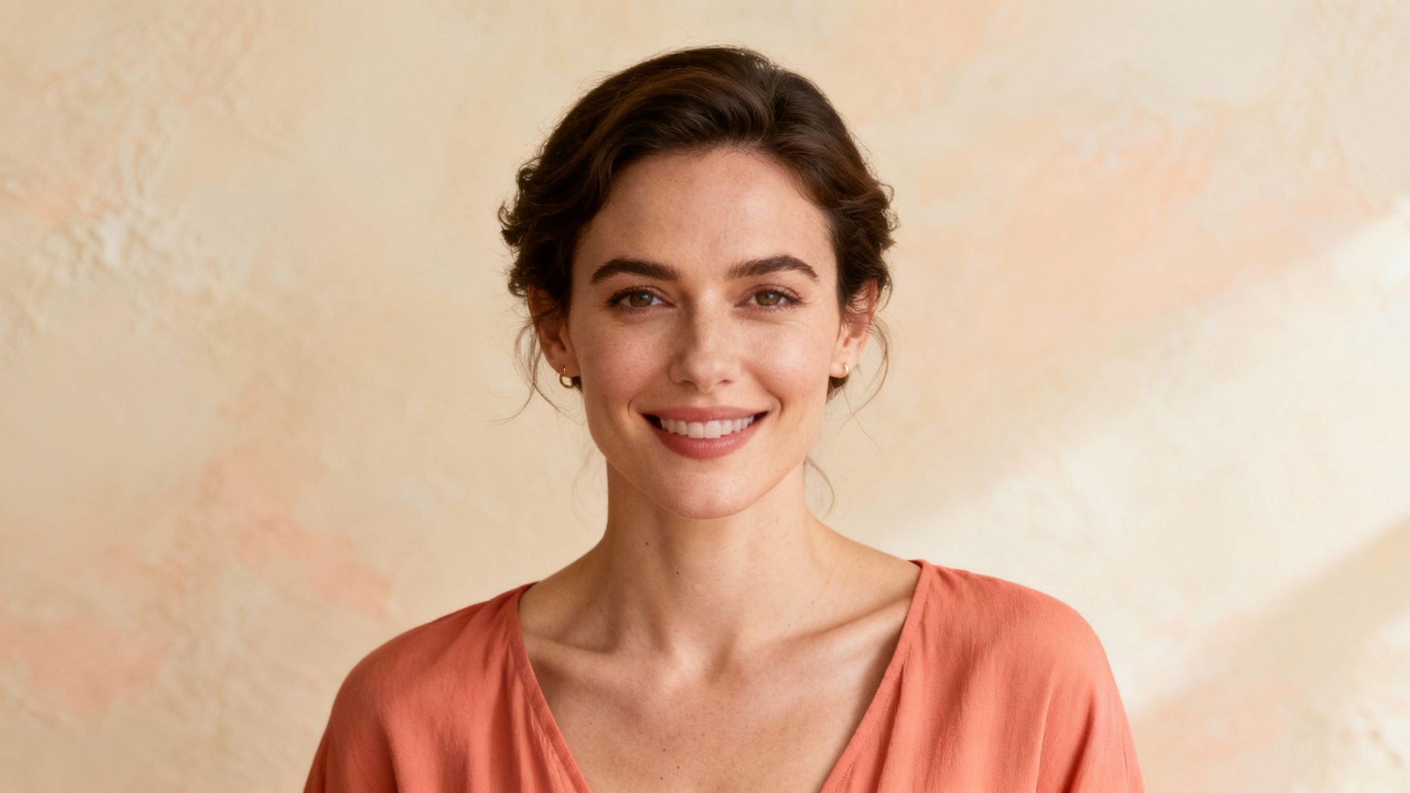
This color family is a favorite among lifestyle vloggers, wellness influencers, and talk show hosts aiming for a welcoming aesthetic. The soft warmth of coral and peach can brighten the complexion and bring a healthy glow to your appearance, helping you connect with your audience on a more personal level. They are cheerful and modern, providing a refreshing alternative to traditional neutral palettes.
Why Warm Coral and Peach Work So Well
Coral and peach shades are exceptional at complementing warmer skin undertones, bringing out golden or olive notes beautifully. For those with cooler undertones, a softer, more muted peach can still add a touch of warmth without clashing. These colors are particularly effective in settings with soft, diffused lighting, where they create a gentle and flattering luminosity that draws viewers in.
Key Insight: Warm coral and peach infuse your on-camera look with approachability and life. They are the ideal choice for content that aims to be personal, uplifting, and engaging, as they naturally enhance your skin’s radiance and create a positive, friendly vibe.
Actionable Tips for Wearing Warm Coral and Peach
To leverage the welcoming energy of these colors, keep these tips in mind:
- Find Your Undertone Match: These colors shine on individuals with warm or neutral skin undertones. If you have a cool undertone, look for a coral with more pink in it or a very pale, soft peach.
- Balance with Neutrals: Pair a coral top or peach dress with soft neutrals like cream, sand, or light gray. This balances the warmth and keeps the overall look sophisticated and grounded.
- Avoid Neon Saturation: Stick to soft, muted, or pastel versions of coral and peach. Bright, neon variations can be too intense for the camera and may cause color saturation issues.
- Test Your Lighting: Always perform a camera test under your specific lighting conditions. Some lights can wash out these lighter tones or alter their hue, so adjust your saturation or lighting as needed.
5. Charcoal Gray and Slate
A sophisticated and modern alternative to pure black, charcoal gray and slate offer a refined look that conveys authority and stability without sacrificing detail. These colors are some of the best to wear on camera for corporate and professional settings, providing a grounded, competent, and serious aesthetic. Unlike black, which can absorb light and hide the nuances of your clothing, these deep grays maintain their texture and form, ensuring you look sharp and well-defined.
This color family projects an image of intellect, strength, and timelessness. It’s a staple for financial analysts, legal experts, and corporate leaders who want to appear knowledgeable and trustworthy. Slate and charcoal gray are less severe than black, making them more approachable while still commanding respect. They work exceptionally well against a variety of backdrops, from a bright studio set to a standard office environment, providing excellent, clean contrast.
Why Charcoal Gray and Slate Work So Well
Shades of gray are neutral, meaning they complement all skin tones by allowing your natural coloring to stand out. They provide a perfect middle ground, offering the seriousness of black and the softness of lighter tones. This versatility makes charcoal and slate a fantastic choice for anyone in a formal or semi-formal role, from a consultant filming a training video to an author sitting for a headshot.
Key Insight: Charcoal gray and slate provide the gravitas of black without its technical drawbacks. These colors read as sophisticated and stable, ensuring that your facial expressions and message remain the central focus while you look polished and professional.
Actionable Tips for Wearing Charcoal Gray and Slate
To leverage the power of these sophisticated neutrals, keep these tips in mind:
- Choose the Right Shade: Opt for mid-to-dark grays like charcoal and slate. Avoid very light grays that might wash out and very dark grays that can look almost black on camera, defeating the purpose.
- Pair with Crisp Accents: Create a dynamic look by pairing your gray garment with a crisp white, off-white, or light blue shirt. This adds a clean, sharp contrast that frames your face beautifully.
- Emphasize Texture: A charcoal gray blazer in a quality wool or a slate-colored knit can add significant visual interest and depth. The texture prevents the color from looking flat under studio lights.
- Use Lighting to Your Advantage: Proper lighting is essential to prevent these darker tones from looking dull. A good key light will highlight the fabric’s details and your features. For more on this, you can learn about the best lighting for portrait photography.
6. Blush Pink and Mauve
Blush pink and mauve offer a sophisticated, modern alternative to traditional neutrals. These gentle tones create a warm and approachable on-camera presence, conveying compassion and creativity without sacrificing authority. As some of the best colors to wear on camera, they are particularly effective for professionals in creative fields or roles requiring a strong element of personal connection, such as coaching or healthcare.
These soft, dusty hues have gained popularity in contemporary professional settings, from tech startups to media interviews. They are favored by modern female news anchors and entrepreneurs who want to appear both confident and relatable. Unlike overly bright pinks, which can be distracting, blush and mauve provide a subtle warmth that enhances skin tones and adds a touch of refined personality to the frame.
Why Blush Pink and Mauve Work So Well
Blush and mauve are wonderfully flattering under various lighting conditions, softening the harshness of studio lights and glowing warmly in natural light. They resonate with audiences by creating an atmosphere of openness and trust. These colors are versatile enough to look professional in a structured blazer or feel accessible in a soft knit sweater, making them adaptable for diverse video formats and brand aesthetics.
Key Insight: Blush pink and mauve are ideal for projecting a modern, approachable professionalism. They soften your appearance on camera, foster connection with your audience, and add a contemporary feel that stands out from more conventional corporate palettes.
Actionable Tips for Wearing Blush Pink and Mauve
To leverage these elegant shades effectively, keep these tips in mind:
- Choose Muted Shades: Opt for dusty, muted versions of pink and mauve. Avoid vibrant bubblegum or magenta, which can be too loud and may cause color balance issues for the camera.
- Match Your Undertone: Select a blush with a peachy undertone for warm skin, and a mauve with cooler, lavender undertones for cool-toned skin. This ensures the color harmonizes with your complexion.
- Pair with Crisp Neutrals: Ground these soft colors by pairing them with crisp white, charcoal gray, or cream. Silver or rose gold accessories add a touch of polish without being distracting.
- Consider Your Industry: These colors are excellent for creative, wellness, or tech industries. In more conservative fields, use them as an accent, like a blouse under a neutral suit, to add a touch of modern personality.
7. Forest Green and Olive
Forest green and olive tones create a natural, grounded on-camera presence that conveys both authority and approachability. These rich, earthy colors are some of the best colors to wear on camera for projecting authenticity and reliability. Unlike brighter, more distracting shades, forest green and olive provide a sophisticated depth that complements the subject without overwhelming the frame, making them ideal for professionals who want to appear both modern and trustworthy.
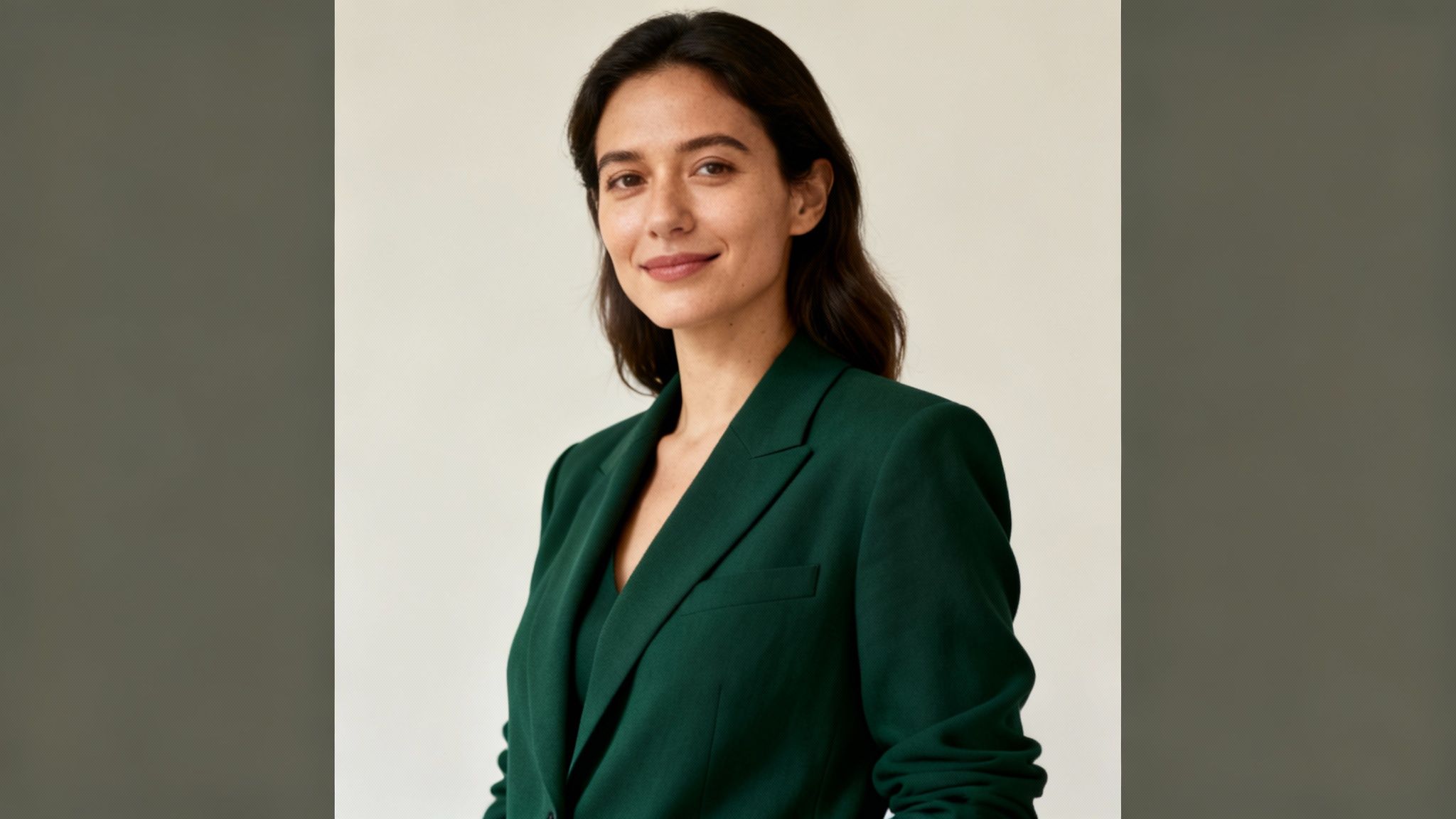
This color family has gained popularity among environmental professionals, wellness practitioners, and creative industry leaders. It projects an image of growth, stability, and a connection to nature, which resonates strongly in fields focused on sustainability and well-being. Forest green and olive are serious without being somber, allowing speakers and subjects to appear knowledgeable yet accessible under various lighting conditions.
Why Forest Green and Olive Work So Well
Forest green and olive are incredibly versatile and flatter a wide spectrum of skin tones. The undertones in these greens can highlight the warmth in darker complexions and bring a healthy, vibrant look to paler skin. Their muted nature prevents them from causing color bleed or creating distracting “vibrations” on camera, ensuring a clean and professional image for everything from a corporate video to an intimate portrait session.
Key Insight: Earthy greens like forest and olive are modern power colors. They signal trustworthiness, growth, and authenticity, making them a superb choice for professionals in sustainability, wellness, and creative fields looking to build a genuine connection with their audience.
Actionable Tips for Wearing Forest Green and Olive
To leverage the natural appeal of these colors, consider these practical suggestions:
- Choose the Right Shade: For a more authoritative look, opt for deep forest greens. For a softer, more approachable feel, a muted olive is an excellent choice. Avoid overly bright lime or neon greens.
- Pair with Earthy Neutrals: These greens pair beautifully with colors like cream, beige, camel, and charcoal gray. Gold or bronze accessories can add a touch of warmth and elegance without being distracting.
- Ensure Good Lighting: While forgiving, poor lighting can make these colors appear murky or almost black. Use sufficient key and fill lights to preserve their rich tones and prevent loss of detail.
- Test Against Your Background: Ensure there is enough contrast between your green outfit and your backdrop. These colors look particularly striking against neutral, warm-toned, or textured backgrounds.
These colors are not just for individual portraits; they also create a harmonious look in group photos. To see how these tones can be integrated into a broader palette, you can explore more on how to style colors for a family photo shoot.
8. Rich Burgundy and Wine
Rich burgundy and wine tones project a unique blend of confidence, sophistication, and authority, adding distinctive visual personality to your on-screen presence. These deep jewel tones photograph beautifully, conveying power and elegance without the severity of pure black. They are particularly effective for professionals wanting to stand out while maintaining credibility, making them one of the best colors to wear on camera.
This color family offers a warm and inviting alternative to cooler tones like navy or gray. Burgundy is often associated with ambition, wealth, and leadership, making it an excellent choice for female executives, thought leaders, and media personalities. It commands attention in a refined way, helping the wearer appear both powerful and approachable. These shades perform well under various lighting setups, holding their richness without appearing muddy or oversaturated.
Why Rich Burgundy and Wine Work So Well
Burgundy and wine are incredibly versatile, flattering a wide spectrum of skin tones. The deep red and purple undertones can bring out a healthy glow in fair skin, complement the warmth in medium and olive skin, and provide a stunning, vibrant contrast against deep skin tones. This makes it a sophisticated and impactful choice for a leadership presentation, a broadcast interview, or an elegant portrait session.
Key Insight: Burgundy and wine are power colors that feel warm and accessible. They command respect while adding a layer of sophisticated personality, making you memorable without being distracting.
Actionable Tips for Wearing Rich Burgundy and Wine
To make this distinguished color work for you, consider these practical tips:
- Choose a True Hue: Opt for a clear, rich burgundy or wine shade. Avoid tones that are too brown or muted, as they can look dull on camera.
- Pair with Minimal Accessories: Let this strong color be the focus. Pair it with sophisticated and minimal accessories, especially gold jewelry, which beautifully complements its warm undertones.
- Check Your Lighting: Ensure adequate, preferably warm, lighting to enhance the color’s richness. In poor or cool lighting, burgundy can lose its vibrancy and appear flat.
- Balance with Neutrals: When creating a multi-piece outfit, balance a burgundy top or blazer with light neutrals like cream, soft gray, or camel to create a polished and harmonious look.
8-Color On-Camera Comparison
Color
🔄 Implementation complexity
⚡ Resource requirements
📊 Expected outcomes
Ideal use cases
⭐ Key advantages / 💡 Tips
Deep Blue
Low — simple, reliable choice
⚡ Minimal — standard lighting, neutral accessories
High professionalism, trustworthiness, consistent contrast
News anchors, corporate presentations, political speeches, exec calls
⭐⭐⭐ Universally professional; 💡 Use navy/royal blue, test under studio lighting
Jewel Tones (Emerald, Sapphire, Ruby)
Medium — match undertone and saturation
⚡ Moderate — careful lighting and color matching
Strong visual branding, vibrant and memorable on camera
Creators, influencers, fashion/beauty, social media
⭐⭐ High impact & recognition; 💡 Pick tone to suit skin undertone, avoid poor lighting
Warm White and Cream
Low — easy but watch for washout
⚡ Minimal — good lighting and texture choices
Clean, approachable, minimalist presence
Interviews, educational content, wellness, tutorials
⭐⭐ Clean and versatile; 💡 Prefer warm whites, add texture and accessories
Warm Coral and Peach
Medium — needs undertone matching
⚡ Moderate — lighting tests, muted shades preferred
Warm, radiant, friendly on-camera energy
Lifestyle, wellness, beauty, social content
⭐⭐ Approachable and radiant; 💡 Use muted versions, pair with neutrals
Charcoal Gray and Slate
Low — straightforward professional option
⚡ Minimal to Moderate — fabric texture and lighting
Sophisticated, competent, polished appearance
Corporate, finance, legal, executive presentations
⭐⭐ Polished without harshness; 💡 Choose mid-charcoal, add texture and light accents
Blush Pink and Mauve
Medium — find muted, professional shades
⚡ Moderate — styling and lighting checks
Modern, approachable, refined personal brand
Creative professionals, interviews, contemporary business
⭐⭐ Modern and flattering; 💡 Opt for muted tones, ensure undertone match
Forest Green and Olive
Medium — shade and background coordination
⚡ Moderate — lighting and background testing
Natural, grounded, distinctive yet professional
Sustainability, wellness, creative industries, nonprofits
⭐⭐ Distinctive and grounded; 💡 Use deeper greens, test against typical backgrounds
Rich Burgundy and Wine
Medium — avoid muddy/dark tones
⚡ Moderate — warm lighting and coordinated accessories
Confident, elegant, authoritative presence
Leadership roles, media personalities, formal events
⭐⭐ Confident and elegant; 💡 Choose true wine/burgundy, pair with warm lighting and minimal accessories
Your Final Checklist for Camera-Ready Color Confidence
Navigating the world of on-camera appearances can feel complex, but as we’ve explored, color is your most powerful tool for making a confident and memorable impression. Choosing what to wear is not just about fashion; it’s a strategic decision that directly influences the mood, quality, and impact of your final photos or videos. From the commanding presence of deep blues and jewel tones to the soft, approachable warmth of peach and blush, the right hue ensures you are the focal point, not a distraction.
The journey to finding the best colors to wear on camera is a blend of art and science. It involves understanding how certain shades interact with your skin tone, the lighting environment, and the camera’s sensor. By moving beyond generic advice and embracing a more intentional approach, you empower yourself to create visuals that are not just beautiful, but also authentic and compelling.
Recapping Your Core Color Principles
To simplify your preparation process, let’s distill the most critical takeaways from our guide into a quick-reference checklist. Think of these as your non-negotiable rules for achieving a polished, professional look every time you step in front of the lens.
- Prioritize Saturation Over Brightness: Deep, rich colors like emerald, sapphire, and burgundy add depth and sophistication without overwhelming the sensor. They prevent the washed-out effect that pastels can sometimes cause and avoid the harsh, detail-crushing nature of pure black or pure white.
- Test, Test, and Test Again: The single most important step is to conduct a camera test. What looks perfect to the naked eye can appear completely different on screen. Use your smartphone to take a quick photo or video in the same lighting and with the same background you’ll be using for the actual shoot. This simple action can save you from major wardrobe regrets.
- Context is King: Your color choice should always serve your purpose. A charcoal gray suit might be perfect for a corporate headshot conveying authority, while a warm coral dress is ideal for a sunny, joyful family portrait session. Always ask: What message am I trying to send? What is the mood of this event or project?
- Mind Your Background: Your outfit should create a pleasant contrast with your surroundings. If you’re shooting against a dark, moody backdrop, a lighter (but still saturated) color will help you stand out. Conversely, a deep jewel tone will pop beautifully against a neutral, light-colored wall. Avoid colors that are too similar to your background, as this can cause you to blend in.
From Theory to Action: Your Next Steps
You are now equipped with the knowledge to make deliberate and effective wardrobe choices. The next step is to put this information into practice. Start by auditing your own closet. Pull out the garments that fall into our recommended color families: the jewel tones, the earthy greens, the rich blues, and the warm neutrals.
Next, create a few go-to “camera-ready” outfits for different scenarios.
- The Professional Look: A well-fitting blazer or blouse in deep blue or charcoal gray.
- The Approachable Look: A sweater or dress in olive green, mauve, or warm peach.
- The Formal Look: An elegant garment in a rich burgundy or emerald green.
Having these options pre-selected removes the stress and guesswork from future photo or video opportunities. It transforms wardrobe planning from a last-minute panic into a confident, creative process. Ultimately, mastering the best colors to wear on camera is about taking control of your narrative. It’s about ensuring that your appearance fully supports your message, your brand, and your story, allowing your personality and expertise to shine through without distraction.
Ready to put these principles into action with professional guidance? The team at Candid Studios specializes in helping individuals and families select the perfect color palettes to create stunning, timeless photographs and videos. Let us handle the technical details so you can focus on looking and feeling your best. Visit Candid Studios to see our portfolio and book a consultation for your next portrait, wedding, or event.
Related: best colors to wear on camera